THE WEBSTER | MOBILE UI

Overview
Provide UX recommendations to rapidly improve the experience of an internal mobile site page for e-commerce fashion site, thewebster.com
THE PROBLEM
Most customers leave a site after putting an item in their cart. This is in large part due to site elements that contribute negatively toward user experience.
PROPOSED SOLUTION
Improve the guest checkout experience and increase user conversions by adapting UX conventions, utilizing alternate payment methods, and introducing a user checkout progress bar.
INITIAL THOUGHTS
What users believe they know about an interface strongly impacts how they use it. Users will form their mental models based on interactions with existing applications and web sites. The shoppers on The Webster have certain expectations and mental models that inform their expectations of a luxury shopping experience. To be competitive, The Webster must meet the baseline of expectations of luxury e-commerce sites.
“USERS SPEND MOST OF THEIR TIME ON OTHER SITES. THIS MEANS THAT USERS PREFER YOUR SITE TO WORK THE SAME WAY AS ALL THE OTHER SITES THEY ALREADY KNOW.”
-Jakob Nielsen
RESEARCH
Due to time constraints, I utilized surveys and Baymard, an E-commerce UX Research repository as a point of reference. After doing a competitive analysis across other sites selling the same product, I found some obvious patterns among top ranking sites. Here’s what I found when researching further:
BUSINESS INSIGHTS
A Recent research by the Baymard Institute indicates that most customers leave a site after putting an item in their cart. Nearly 7 out of 10 customers abandon their carts before fully completing online checkout and remains to be a major hindrance to conversion. This is in largely in due to site elements that contribute negatively toward user experience.
Here is the breakdown for why mobile users don’t convert:
20.2% — security concerns
19.6% — unclear product details
19.6% — inability to open multiple browser tabs to compare
19.3% — difficulty navigating
18.6% — difficulty inputting information.
ENTRY TO GUEST CHECKOUT
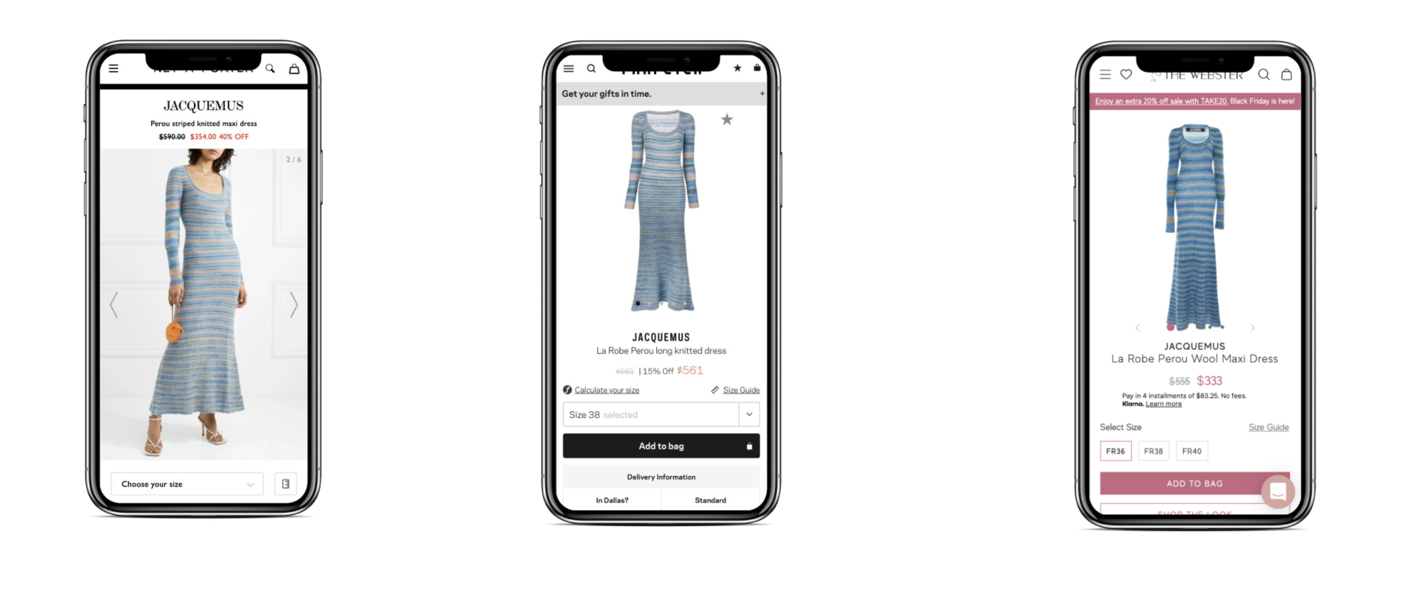
Competitor analysis was done by shopping for the same exact product across several different retail brands, the Jacquemus Perou Dress. With the Chrome extension, wappalyzer, I was able to peer into competitor tech stacks. The most relevant e-commerce competitors with lookalike audiences were FWRD, Net-a-Porter and Far Fetch.
Google reviews, indicated a large disconnect from the brand imagery, to the in store shopping experience, and the online experience.
Most notably, the copywriting for the product description lagged behind on The Webster. Competitor’s noted what size the model was wearing and provided details like their height and body type which provides more context for the user.
Images were bright and saturated in competitor photos
Although the Most competitive price was on The Webster, it was not on the first pages of google’s mobile index
Compared common design patterns on high performing e-commerce sites such as JET, Best Buy, and others across industries to find methods that are conventional but effective in the critical checkout page.
Reviewed best in class overall guest checkout experiences across industries
Made note of conventions, microcopy, feedback and what was in view above the fold
COMPETITOR SITES
UX RECOMMENDATIONS
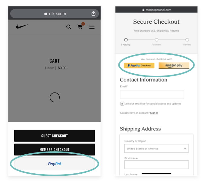
LEVERAGE ALTERNATE PAYMENT METHODS
As soon as users initiate the guest checkout flow, give them the option to checkout with alternate payment methods to decrease the likelihood of abandonment.
Your customer is more aware of payment methods than most. They may be what we call in UX: Power users- they are likely logged in already and are accustomed to the using alternate payment methods
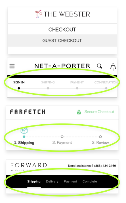
UTILIZE CONVENTIONS
Clearly define where the user is in their guest checkout journey with visual cues upon flow entry
Visual cues can be identified by chronological timelines, numbers, etc.
On mobile screens, there is such little real estate , so everything must be intentional and informational or facilitate the user through the experience.
The Webster uses the same title twice
Among some competitors, the Webster is the only that does not signify to the user how many steps they have to go to checkout once they enter the flow
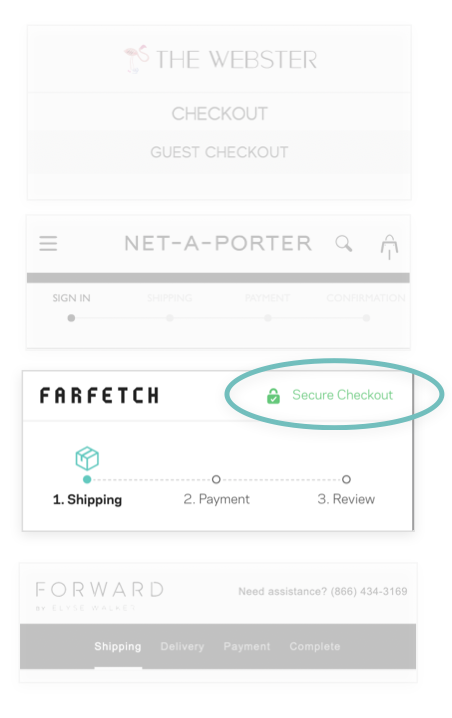
REINFORCE SECURITY STANDARDS
For The Webster, the security badge was in the footer, which is most likely not viewed by the User. It was not indicated by color or a recognizable icon.
If a site handles sensitive information, you likely have a security program and may even have a security badge displayed on the checkout page.
For The Webster, the security badge was in the footer, which is post likely not viewed by the User. It was not indicated by color or a recognizable icon.
However, Baymard Institute’s exhaustive UX study discovered that users feel more secure if payment fields appear to be more secure.
Many users felt more confident in the site’s security when badges were placed in close proximity to sensitive fields (such as payment fields). Sites can further emphasize security by visually encapsulating payment fields.
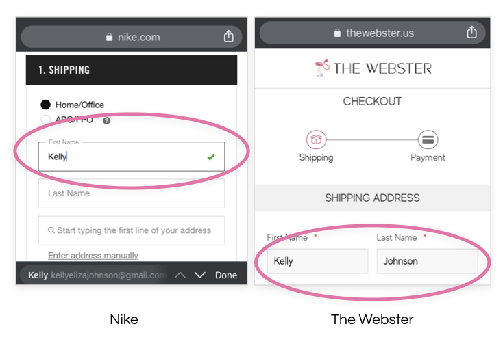
PROVIDE FEEDBACK
Provide a visual feedback cue to users to signify that they have successfully completed a form
Visual cues can be identified by icons, active and inactive states and use of color
Positive feedback has been proven to enhance experience
There needs to be some indication that informs the the user that their action caused something to happen
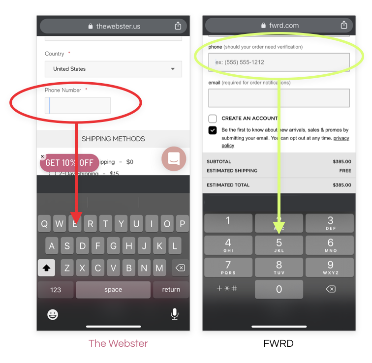
FACILITATE EASE OF DATA ENTRY
Trigger the appropriate keyboard depending on the type of form entry
Fields that require numbers should trigger the numeric keyboard
CHALLENGES & FURTHER CONSIDERATIONS
Tagging and implementation
Utilizing heat maps
Reducing the arrangement/ amount of plugins running